Context
B+C Ingénieurs operates from four offices, from Montreux to Geneva, across everything that concerns land and its use: official surveying, land management, spatial planning, infrastructure, hydraulics. Part of its remit is delegated by the state, a legitimacy no competitor can buy.
That legitimacy was also a ceiling. The founding profession pointed back to boundary markers and the land registry, while most of the value is created long before that, in analysis and advice. The brand said where the company came from, not how far it had gone.
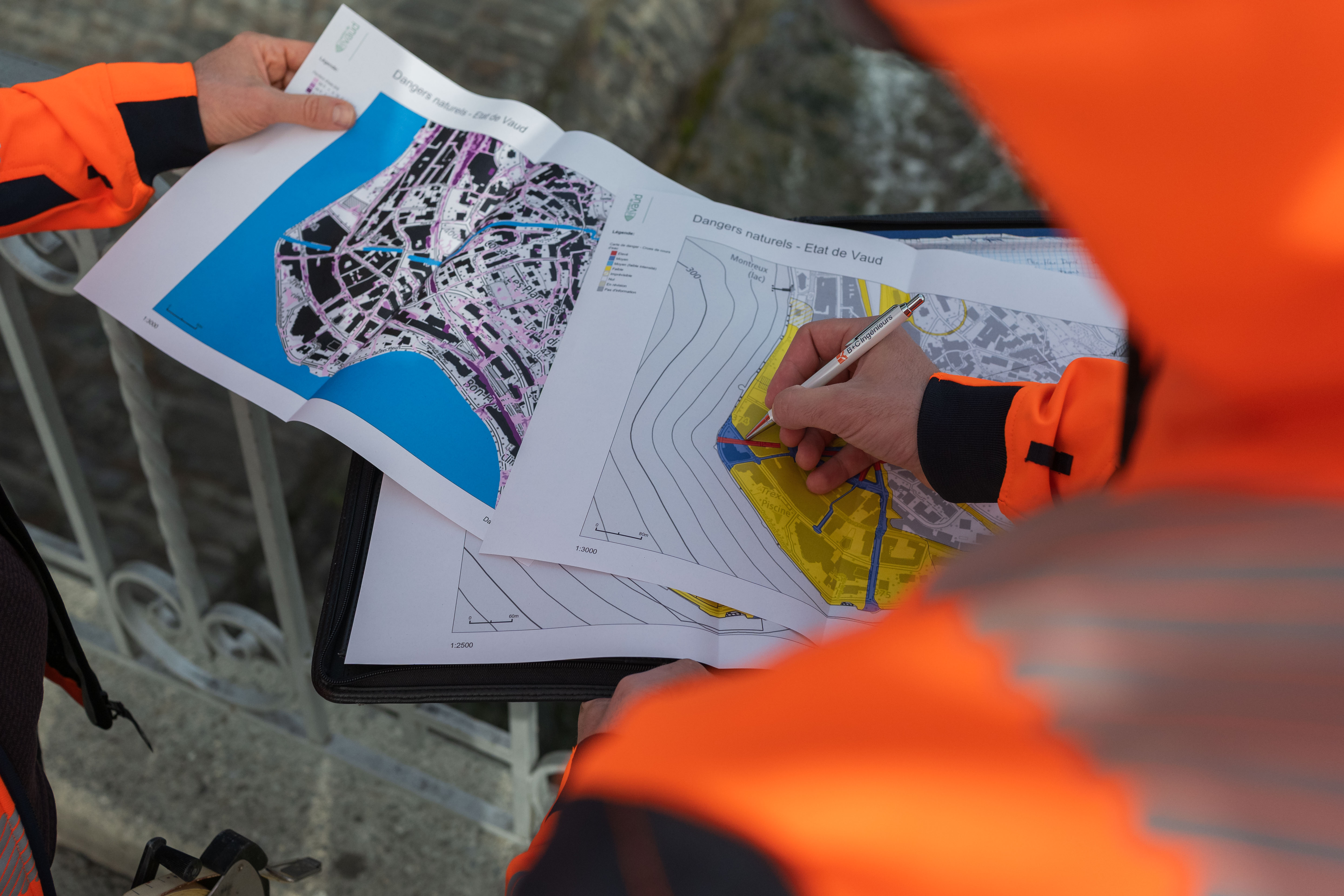
Case study
Nobody calls B+C to measure a plot of land. They call to find out what to do with it.
Every brand is judged on three levels, and we cross-reference them systematically: what it shows, what it actually is internally, and what its market values. The gap between those three readings is the diagnosis. We document it through an audit of existing materials, immersion sessions with leadership and then with the teams, and a benchmark that compares postures rather than aesthetics. The output is not a report but a reference framework: positioning, audiences, promise, tone.
At B+C, the workshops surfaced a word the company used nowhere in its communication: territory. The business does not sell measurements, it sells a reading of the land and of what can be built on it.

A strategy is only worth what can be executed. We always structure it in three phases: foundations, communication, acquisition. You do not address the market before you are legible, and you do not invest in acquisition before you have something to convert with. Every action follows the same grid: strategic objective, implementation plan, expected impact. The whole is delivered as a portal the teams can consult, not a document that gets filed after the presentation.
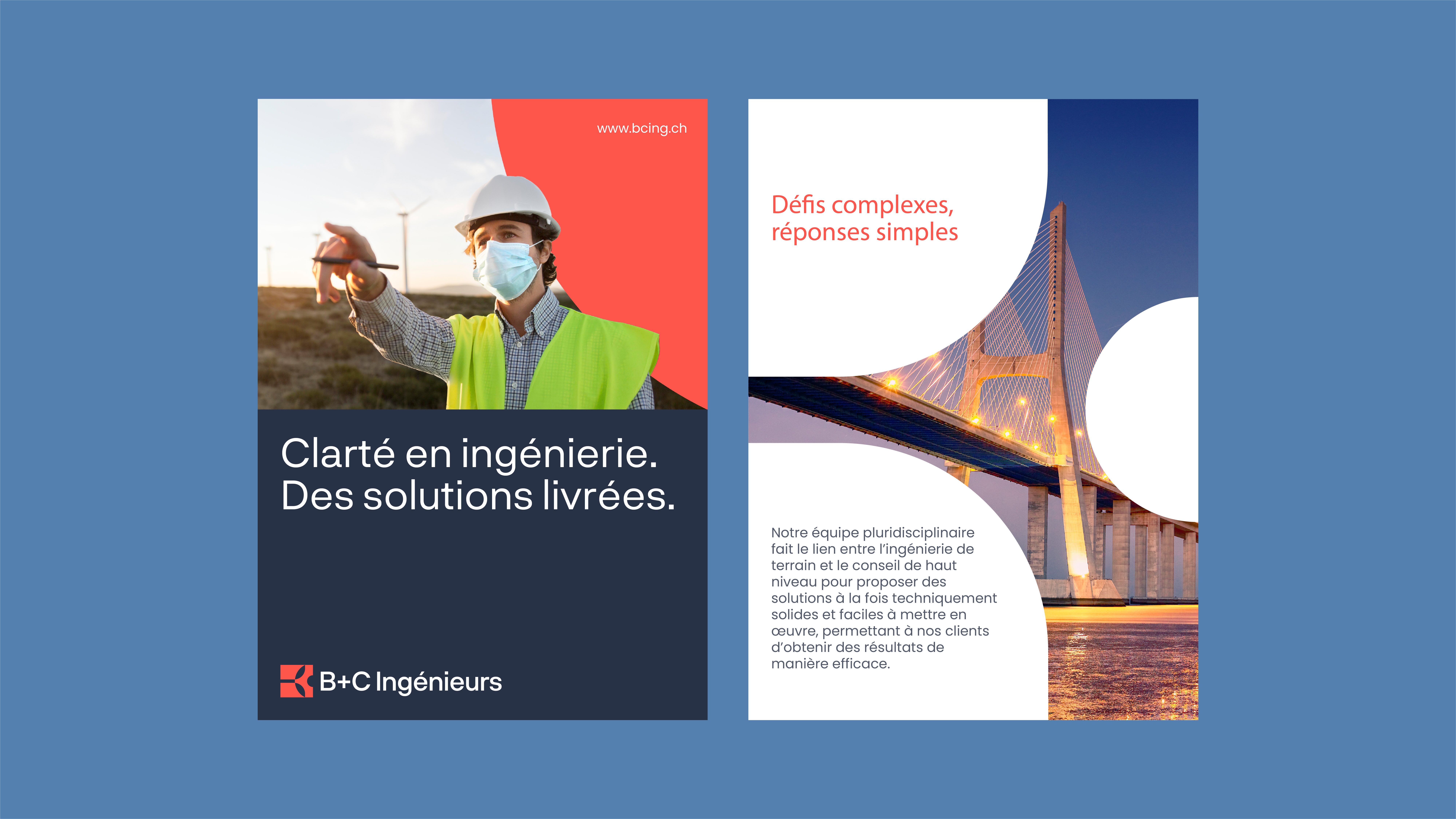
At B+C, the position came down to three verbs the team took up as their own: we analyse, we advise, we deliver. Expertise comes before execution, and three distinct audiences, public authorities, architects and private developers, finally hear the same thing.

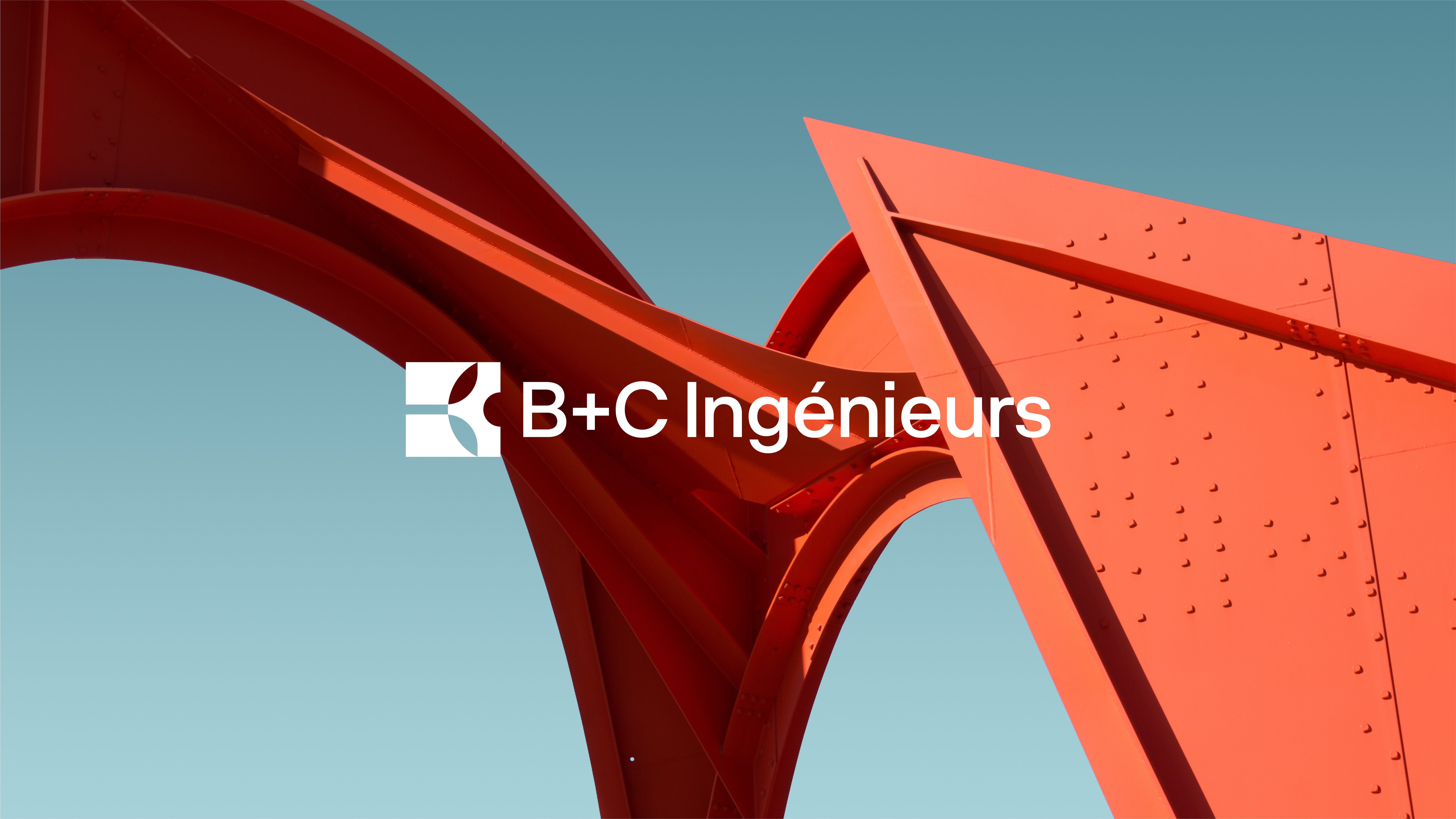
An identity is not chosen on taste. It follows from the positioning, or it does not hold. Logo and its constructions, palette, typefaces, layout principles, physical and digital applications: an overview of the new B+C Ingénieurs branding is available here.
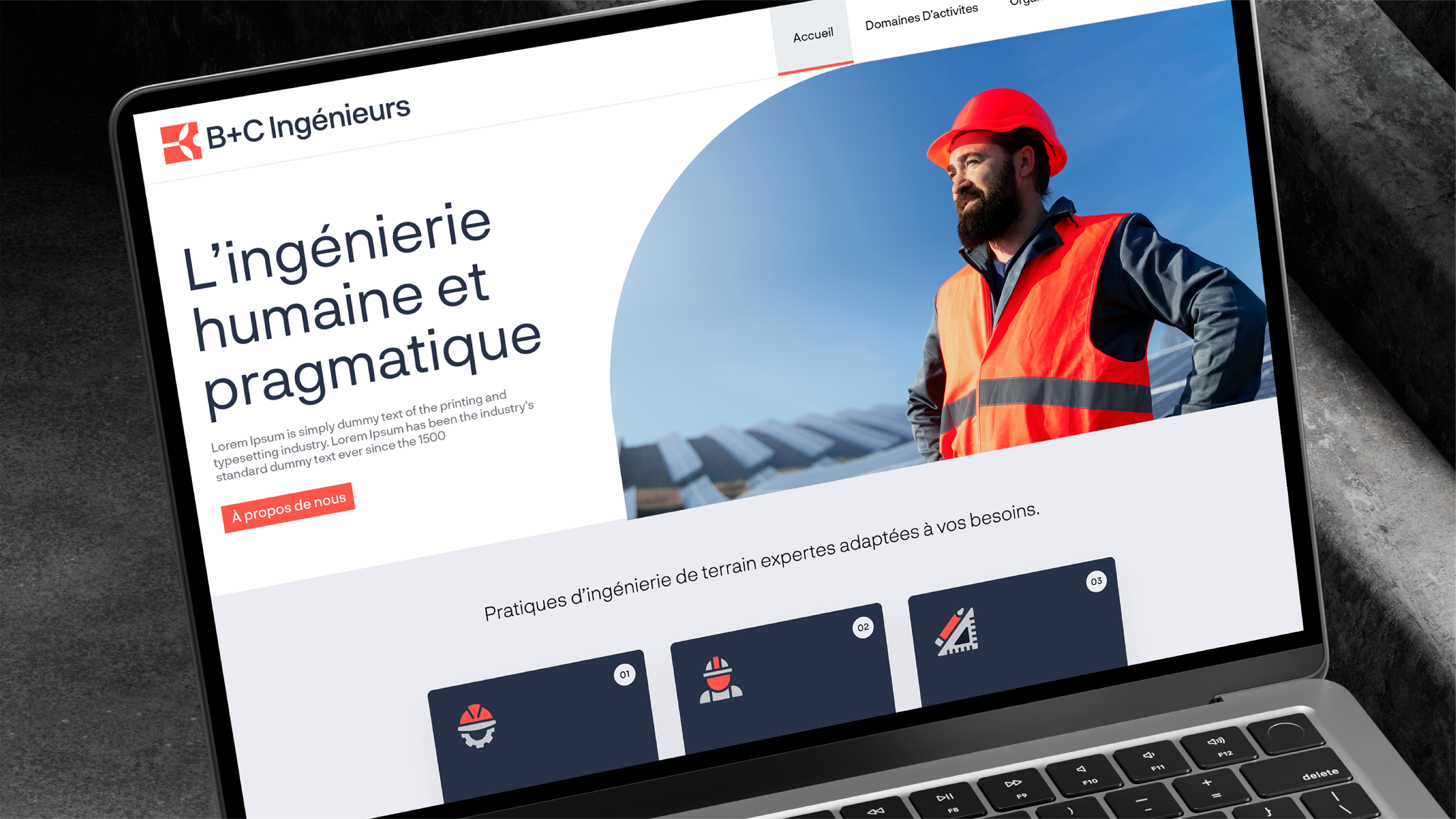
The symbol joins the B and the C into a single form suggesting a gear, and a decisive red breaks with the institutional blues of the sector without conceding anything on rigour. A photo and film campaign followed, so the company would stop illustrating itself with images that are not its own. The new website deploys the whole system.




.svg)
.svg)
Your brand deserves better than ordinary.
30 minutes of honest conversation about your brand. No pitch, no sales, just a real discussion.

© 2025 lagencedare