


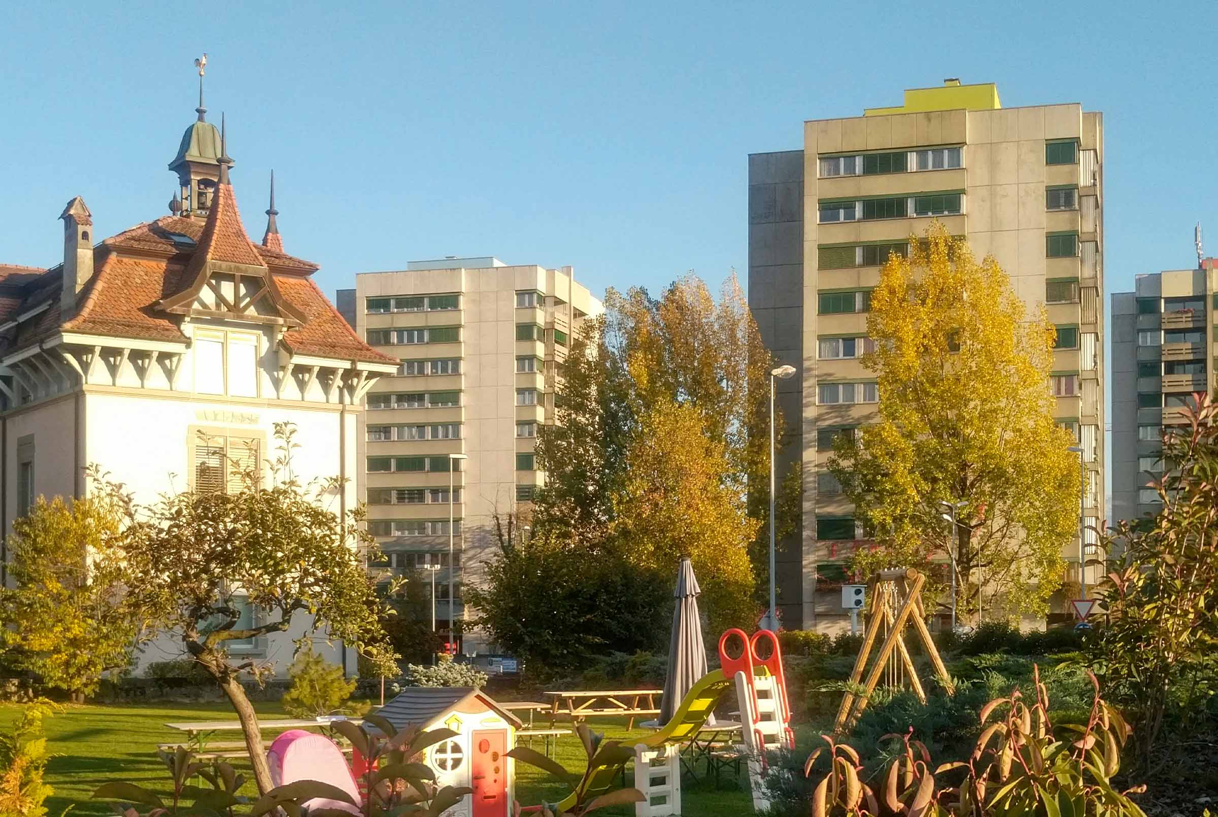
The Municipality of Chavannes-près-Renens entrusted us with its new visual identity, built with its residents.
A town undergoing rapid change, open and diverse, Chavannes-près-Renens wanted an identity that reflects what it has become and where it is heading.
Following a public tender, the Municipality entrusted us with a complete redesign of its visual identity. A municipal identity belongs first and foremost to the people who live in the town every day. We therefore chose a participatory approach, involving both the administration and the population at many stages of the process.


A participatory approach
We held workshops with representatives of the Municipality and with residents. These sessions brought out what makes Chavannes unique in the eyes of its population: its architecture, its community spirit and its ability to bring very different cultures together.
Three symbols emerged: the square, for living together and the brick that shapes the town's architecture; the bridge, which connects people and cultures; and the circle, for unity and cohesion. Chosen by the residents, these shapes became the foundation of the entire identity.
The first animated logo for a Swiss municipality
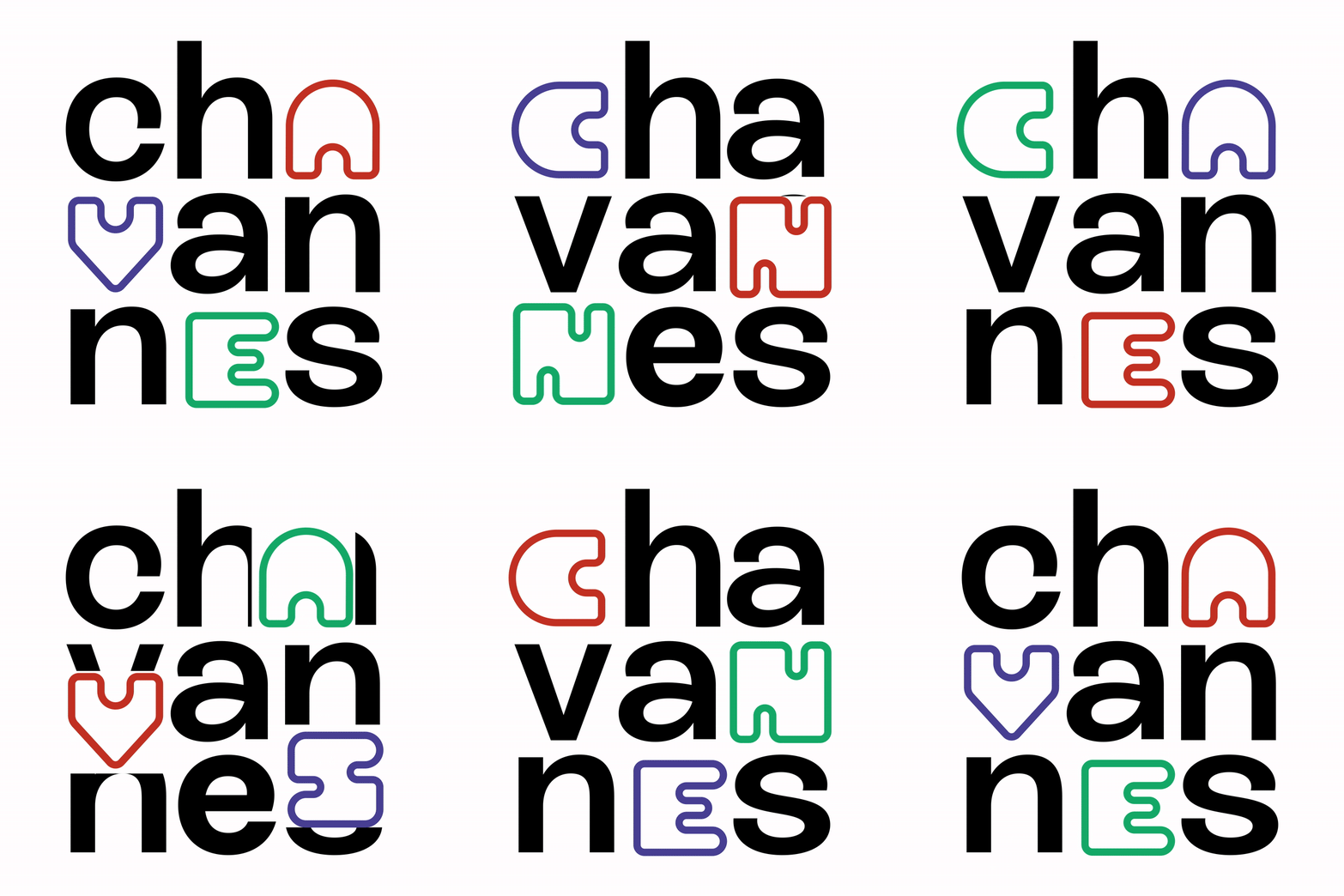
The three shapes define a grid on which we drew an alphabet unique to Chavannes. The logo is built from it: the letters sit on a three-by-three grid, and three of them take on the bridge, the heart and the brick, in red, blue and green.
The logo was designed from the outset to be animated, a first for a Swiss municipality. In motion across all digital media, it expresses the idea of a town in constant evolution, welcoming and forward-looking. On printed materials, it is used in its static version.
A complete identity system
Beyond the logo, we developed a full alphabet with numbers and punctuation, a reference typeface, a three-colour palette and a family of pictograms built on the same grid. Every element stems from the three shapes chosen by the population.
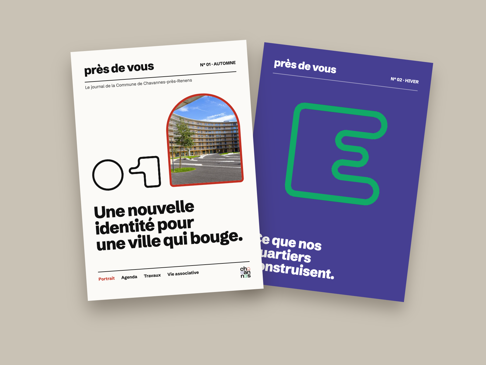
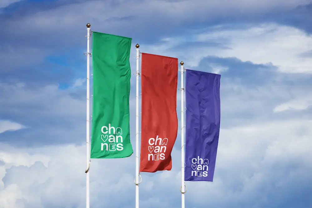
The identity was rolled out across the Municipality's materials, from posters and stationery to waste collection bins. A brand guide documents all the rules of use for the municipal services.

An identity born from the community
Every shape in the logo was chosen by the residents, who recognise themselves in the image of their town.

A first in Switzerland
Chavannes is the first Swiss municipality with a logo designed entirely for animation.

A coherent system
From the alphabet to the pictograms, every element rests on the same grid and the same symbols.
Discover other projects

Your brand deserves better than ordinary.
30 minutes of honest conversation about your brand. No pitch, no sales, just a real discussion.

© 2025 lagencedare
