Chavannes-près-Renens
Refreshing the image of a city: a major challenge we took on
Following a successful public tender, we were selected to support the small yet ambitious Municipality of Chavannes-près-Renens, located in the Canton of Vaud, Switzerland. We are taking you behind the scenes of this large-scale project.
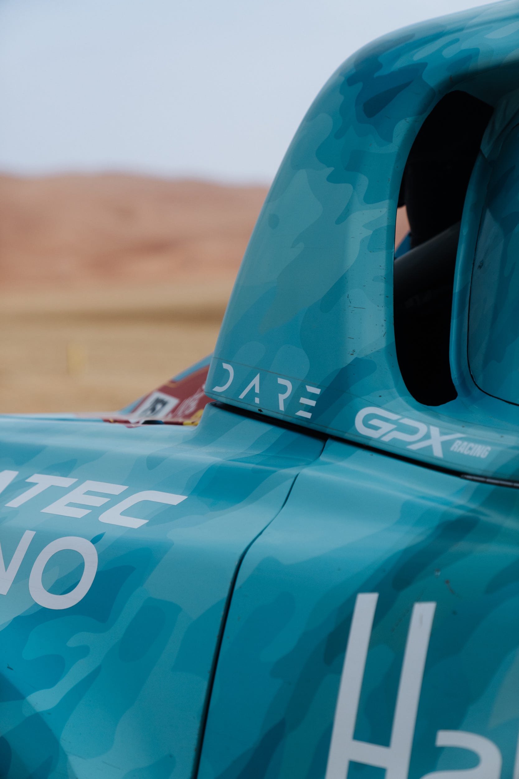
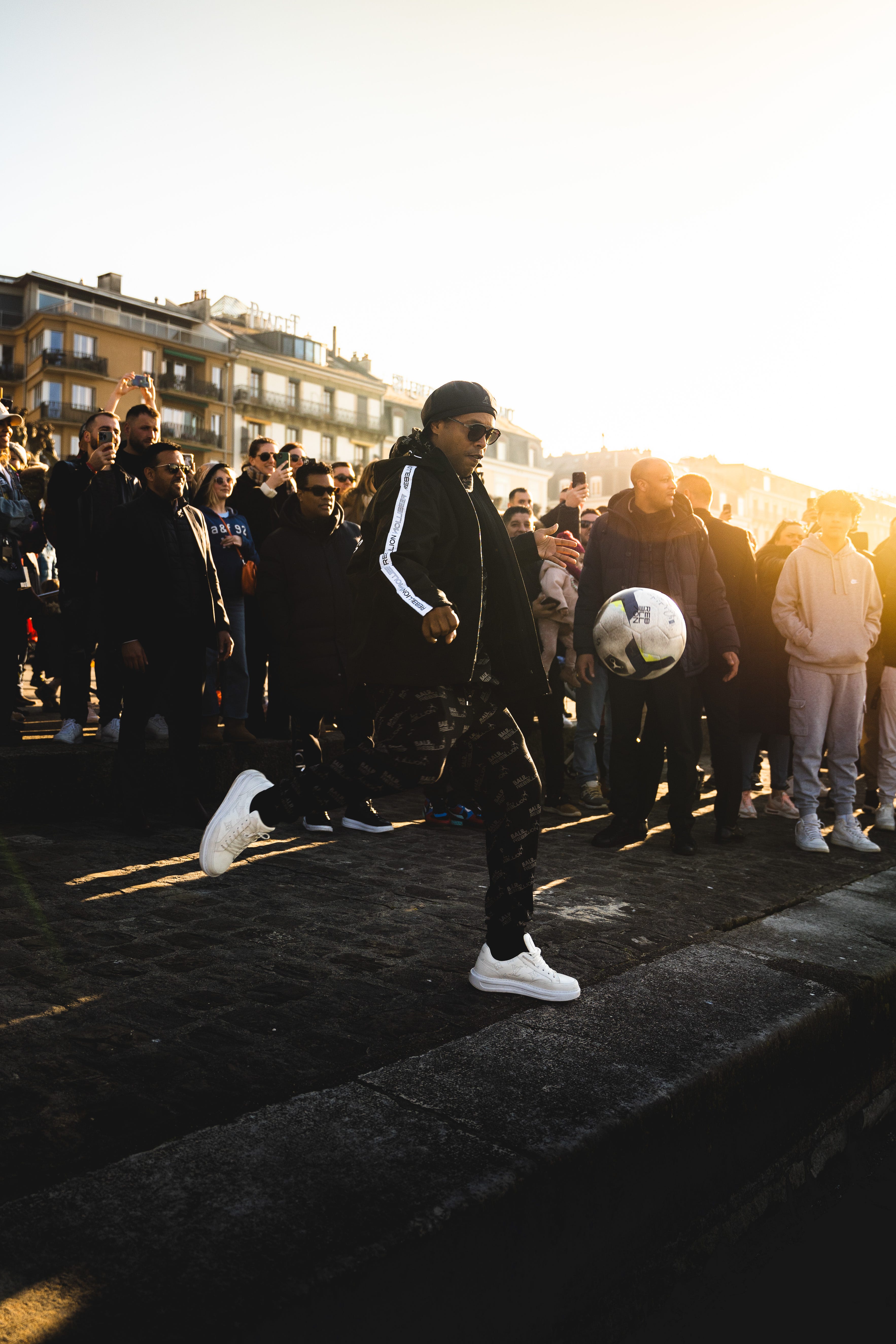
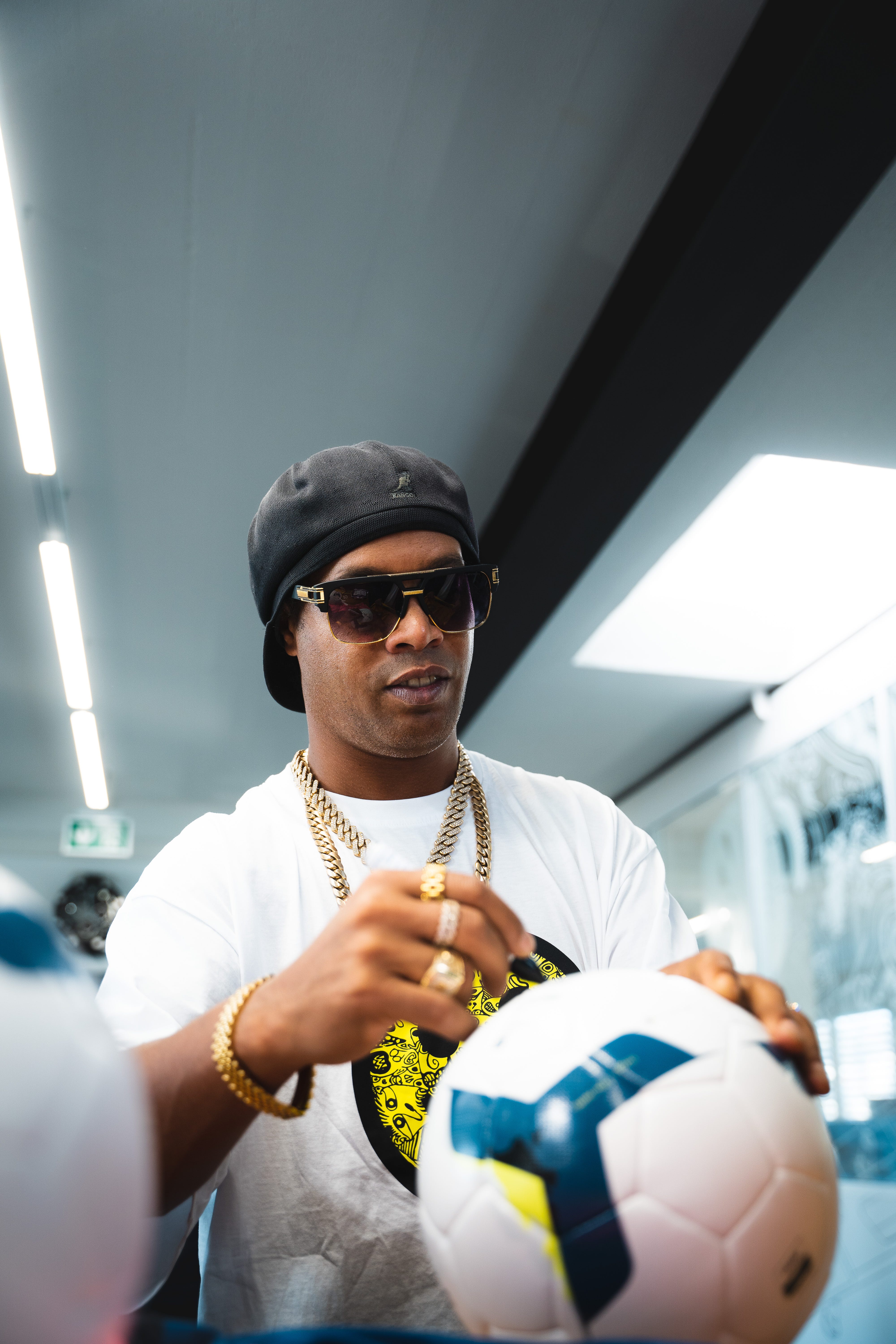
Some projects leave a lasting mark on a company’s journey, and this one is certainly among them. It all began in January 2023, a year that started strong for us, as we had just completed the production of a Dakar documentary and… filmed a brand campaign with football legend Ronaldinho.
As the saying goes, never two without three. The third project we won that year was the complete rebranding of a Swiss municipality, more specifically Chavannes-près-Renens. A first for our Brand Factory.
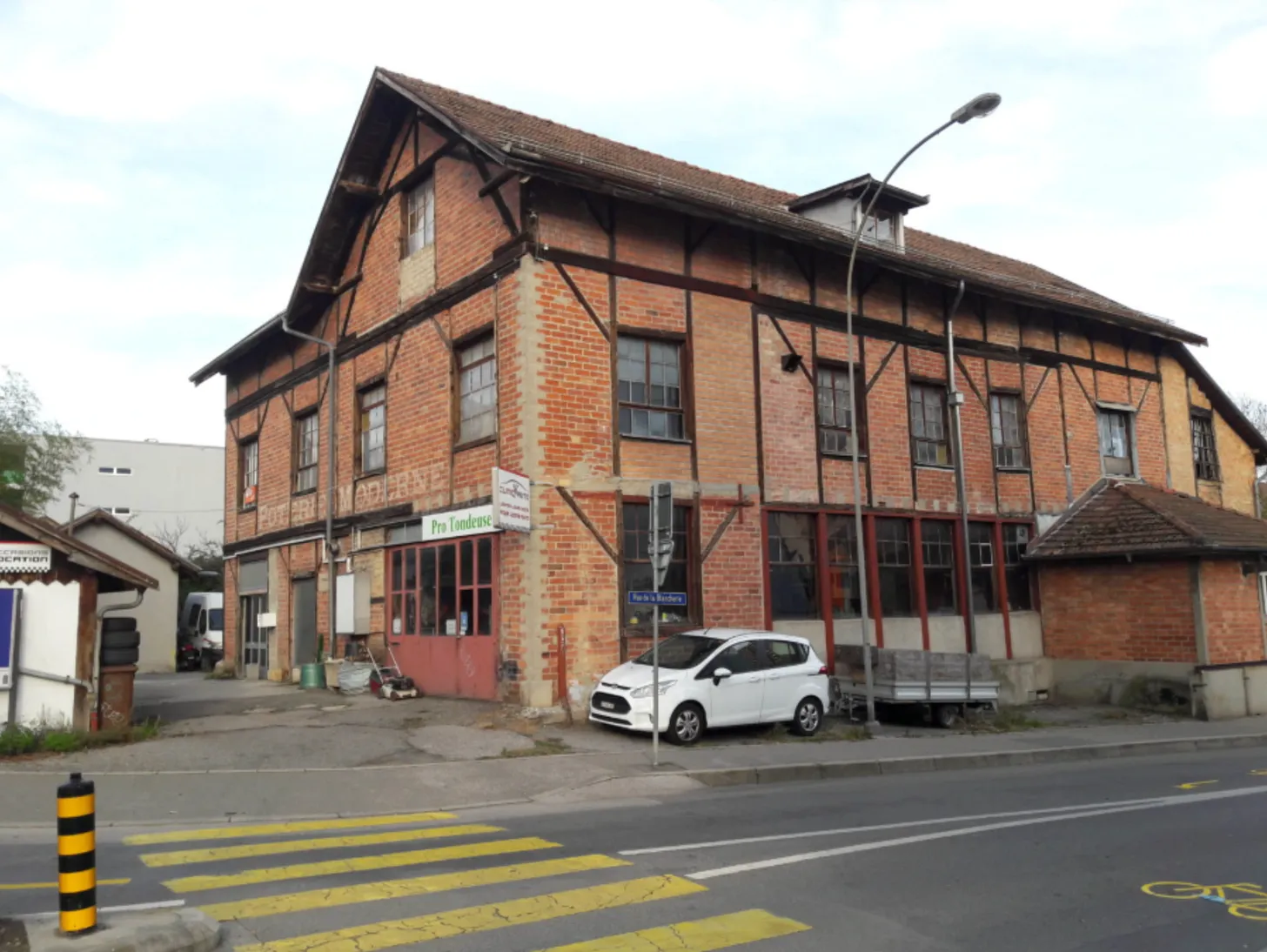
This small village, which has since become a city, immediately reminded us of the indomitable Gauls. Covering just 1.65 km², this small municipality held many strengths: a strong history, a solid heritage, and a highly strategic geographical location (EPFL, University of Lausanne, Vortex, etc.).
A public mission
The mission we received was simple in theory, yet substantial in scope: to rethink the visual identity of the Municipality in order to make it more attractive. But a municipality implies a public-interest mission. And a public-interest mission implies political considerations, residents, and, of course, strong emotions. We therefore had to integrate all of these elements into our equation to build an action plan capable of delivering a result aligned with the Municipality.
Because what could be worse than a city changing its identity to something that, in the eyes of its residents, no longer feels like itself?
A city ≠ a company
One very important detail could not be overlooked in this project: rethinking a city’s brand is nothing like rethinking a company’s brand.
In a company, people come and go over increasingly short periods, especially with newer generations.
In a city, people settle there with the intention of staying for the long term. Not to earn a living, but to live. To build a family. To make friends. And… to remain. A city is shaped partly by its political and municipal momentum, of course, but also by its population, its history, and its heritage.
So many elements that had to be considered at all costs in our thinking, otherwise we risked creating more frustration than joy. That is why, as a first step, we had to understand the history of the Municipality, its origins, its major milestones, its strengths, its weaknesses, its challenges, the foundations on which it was built and… on which it will continue to be built. We generally refer to this phase as the “Empathy Phase”, because it is essential for us to step into our client’s shoes, to understand with their heart, see through their eyes, and feel with their gut.
Branding should not please its creator
There is one behavior that, in our view, can be highly toxic in the agency world: trying to create branding that primarily pleases its creator. We will not hide it from you: our profession is a concentration of emotions and egos. Two ingredients that can very quickly interfere with a project and create tension. This is why, several years ago, we established a rule at DARE:
“Leave ego aside to do our job better.”
Some agencies produce visually stunning branding that flatters their ego, but that unfortunately has not been designed with results in mind. Because yes, beyond being a visual, branding is a marketing tool. It has to work. It has to speak, convey, evoke, live, and shine with a specific purpose.
We therefore had to fully understand the Municipality, its residents, its businesses, its employees, its politics, and its history in order to aim accurately.
A collaborative approach
We then structured our approach around two pillars:
The Municipality, representing intention, as it is the driving force behind the city’s future.
The residents, representing emotion, as they are the ones who, year after year, bear witness to the city’s past, present, and future.
We therefore organized several reflection sessions with municipal employees, as well as with residents of the Municipality. But rather than selecting the participants ourselves, we chose a more spontaneous approach: volunteering. Once the dates were announced, residents could sign up themselves to share their ideas and feelings. This exercise proved to be extremely enriching, and emotionally powerful, thanks to the diversity of the panel. We had to create a climate of listening in which both long-time residents and newcomers could freely express their vision of Chavannes-près-Renens, both for tomorrow and for yesterday.
In these workshops, we favored a funnel approach: the initial reflections aimed at divergence, allowing everyone to express themselves freely. Then, little by little, we sought convergence, ending with shared notions across all groups.
Our role here was not to influence, but to listen, feel, understand, and analyze. A role of active listening that allows us to quickly create a connection and to say, through posture: “your opinion matters.”
Nearly ten different versions
Once the workshops were completed, our team had enough material to begin laying the first foundations of the Municipality’s new identity.
There was no question of putting pressure on the client. We were already aware of the weight that would rest on their shoulders when choosing one or more graphic proposals. We therefore used the metaphor of doors:
The client could freely and without pressure decide whether to open or close the doors, in other words, the visual identities presented to them.
Of course, we made it clear that our team had no emotional attachment to the proposed concepts. Whether their feedback was positive, negative, pleasant, or unpleasant, we were once again there to listen and to say, through posture: “your opinion matters.”
In the end, nearly eight versions were required to arrive at the one that brought everyone together. An interesting observation: in the more than 50 rebranding projects we have carried out for companies, three versions were usually enough to reach approval. But in a “City” context, the stakes, expectations, and environment made the challenge considerably more complex.
Bringing the visual identity to life
These are the four pillars that guided the creation of the Municipality’s new identity:
Movement
The Municipality may be small, but it is extremely vibrant. It is in motion, and it is geographically surrounded by movement: rivers, universities, cultures, sports. To translate this strength into the brand, we opted for the very first animated logo for a Swiss municipality. In other words, the official version of the logo is an animation, establishing from the very first glance this notion of movement, energy, and life.
The square
An elegant nod to the famous bricks of a former factory in the Municipality, a symbol of heritage and history.
The bridge
It represents not only the link between the many cultures present within the Municipality, but also the bridges created by its numerous rivers.
The circle
A symbol of togetherness. A small Municipality, yet rich in diversity, cultures, and cohesion.
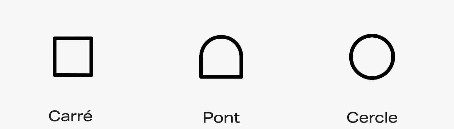
We combined all of these elements to arrive at a clear concept: an identity capable of transforming, moving, and living, just like the city itself.
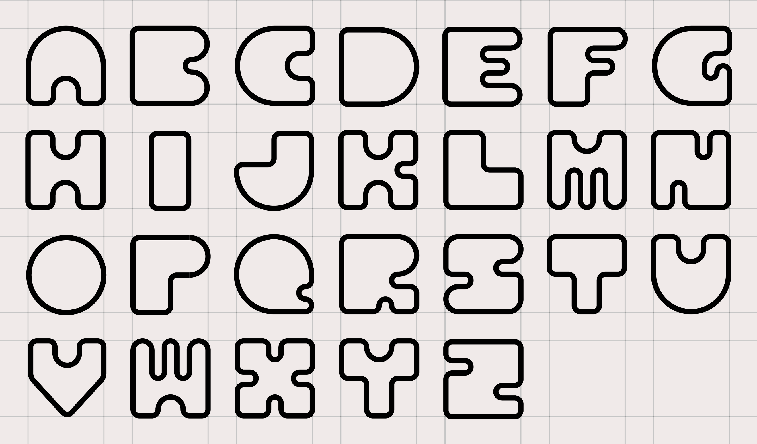
To achieve this, we designed a complete alphabet, in which each letter brings the Municipality’s three symbolic shapes to life and allows them to evolve.
We then sought to animate the visual identity to convey the idea that Chavannes-près-Renens is a city in motion.
The goal was not to create a symbol frozen in time, but an identity capable of supporting the city’s future developments without ever denying its past. A brand that does not seek to impose itself, but to coexist. To bring people together.
A branding that does not exist solely on letterheads, but comes to life through media, uses, events, and the Municipality’s everyday communications.

What this project taught us
Rethinking the identity of a city reminded us of one essential truth: branding is not a matter of taste, but of responsibility. Responsibility toward residents, toward history, and toward the future.
This project also confirmed that our role, as a Brand Factory, is not to impose a vision, but to create the conditions for a collective vision to emerge. To listen more than we speak. To feel before we draw. To guide rather than impose.
And above all, to never forget a simple yet fundamental rule:
A brand is not created for those who design it, but for those who will live with it.
So, what do you think of this visual identity?
PS: DARE’s mission was limited to the design of the visual identity. Another agency took over the website and communication aspects.
DARE is a branding and consulting agency based in Switzerland, in Forel (Lavaux). Since 2018, we have been supporting brands in their launch or refresh through an approach rooted in entrepreneurship, collective intelligence, and real-world feedback.
At DARE, every project truly matters. That is why we only take on one project per month. More information www.madebydare.com.
Thank you for reading DARE Inside ! Subscribe here for free to receive new posts.
© 2025 lagencedare
