Context
CFJM has been training journalists and responsible communication professionals in French-speaking Switzerland for more than sixty years. Two distinct streams, two audiences, two professional cultures, under a single name.
When the institution came to DARE, its brand had aged and no longer distinguished between its two domains. The risk was not cosmetic. A journalist and a communications professional do not enrol for the same reasons, and a brand that blurs the two ends up convincing neither.

Case study
Two professions the industry sometimes sets against each other. One brand had to carry both.
Every brand is judged on three levels, and we cross-reference them systematically: what it shows, what it actually is internally, and what its market values. The gap between those three readings is the diagnosis. We document it through an audit of existing materials, immersion sessions with leadership and then with the teams, and a benchmark that compares postures rather than aesthetics. The output is not a report but a reference framework: positioning, audiences, promise, tone.
At CFJM, the essence came down to a single line: the meeting point of journalism and communication in French-speaking Switzerland. What remained was to make it legible without merging the two streams.

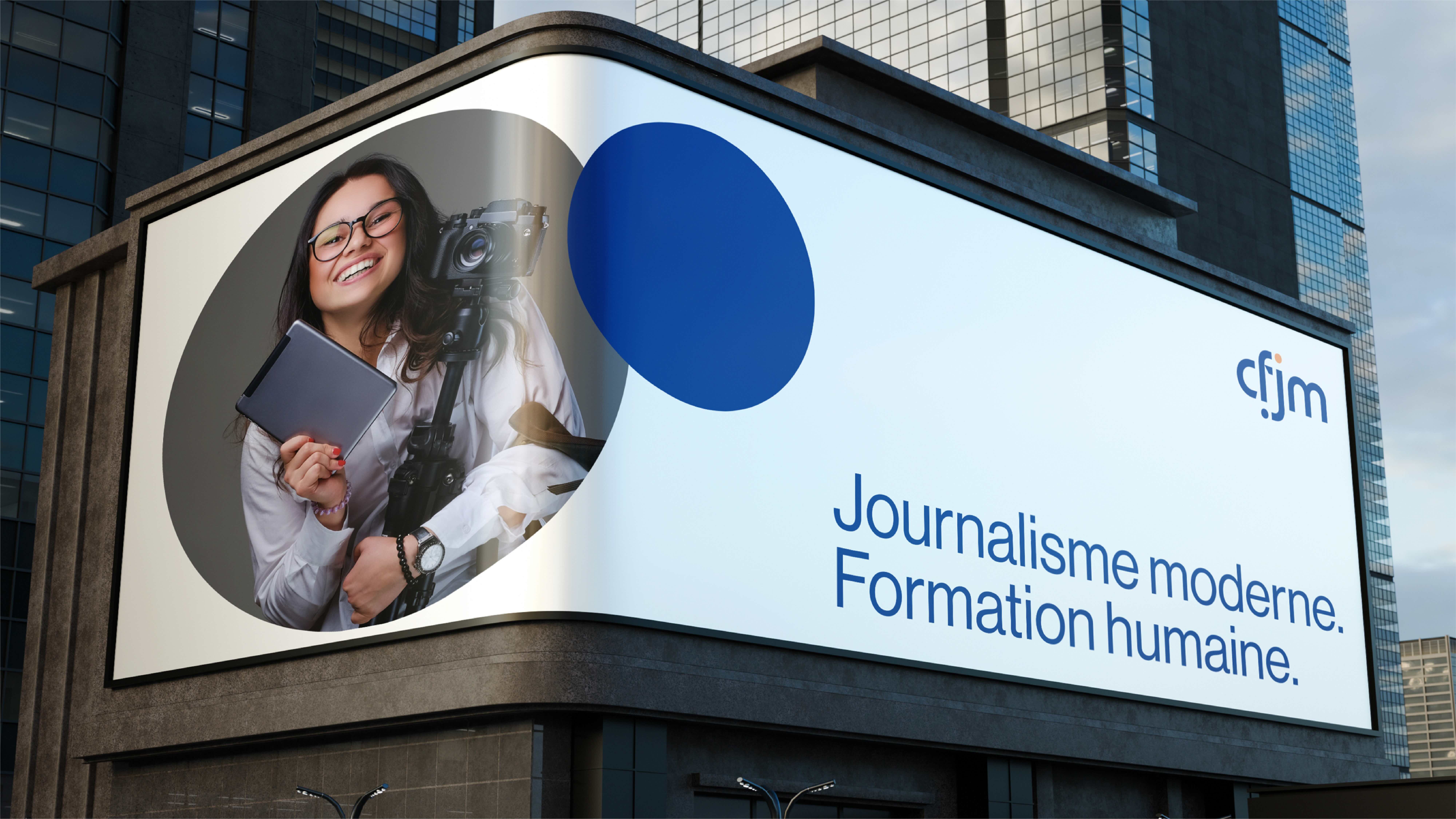
An identity is not chosen on taste. It follows from the positioning, or it does not hold. Logo and its constructions, palette, typefaces, layout principles, physical and digital applications: an overview of the new CFJM branding is available here.
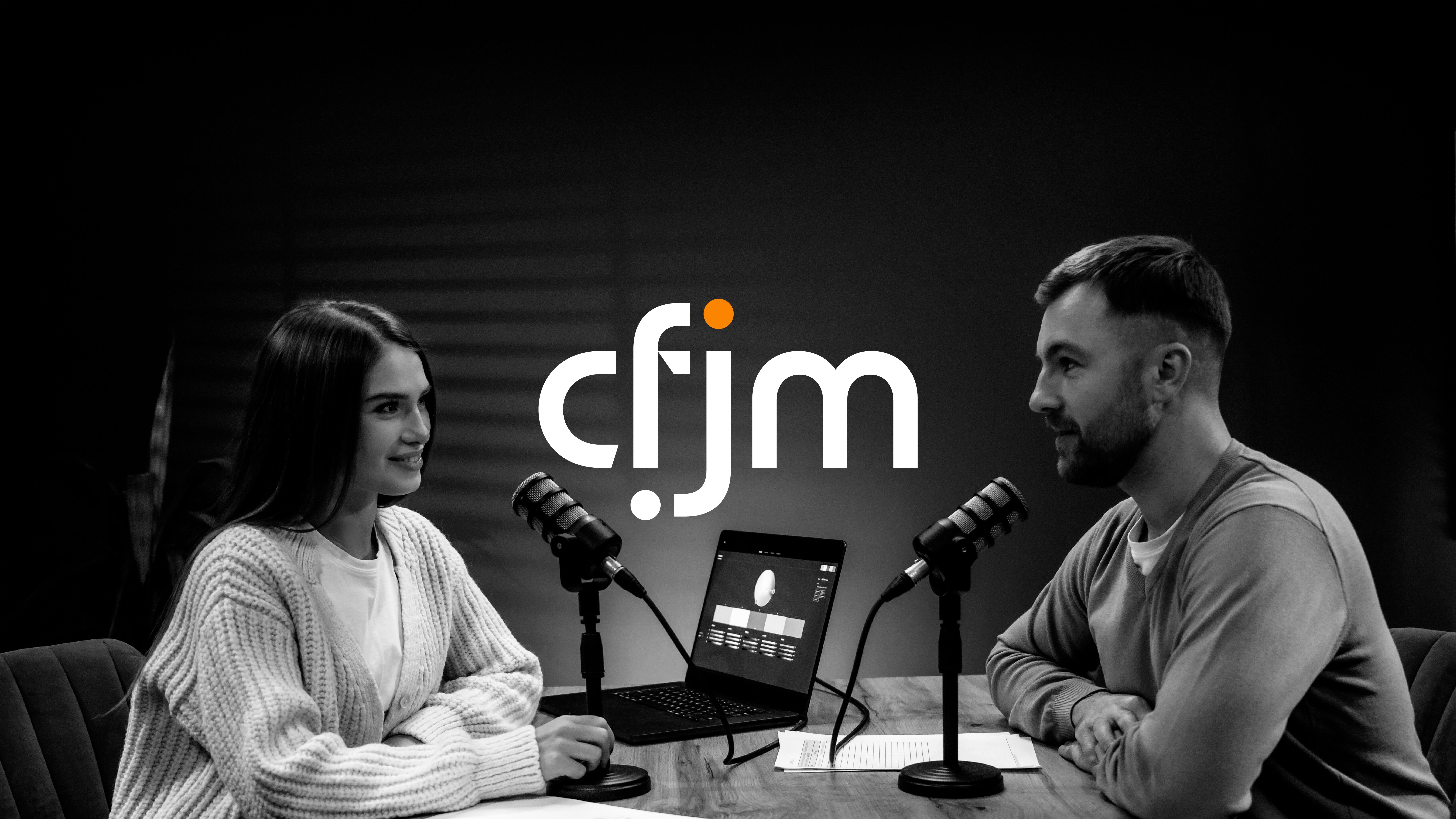
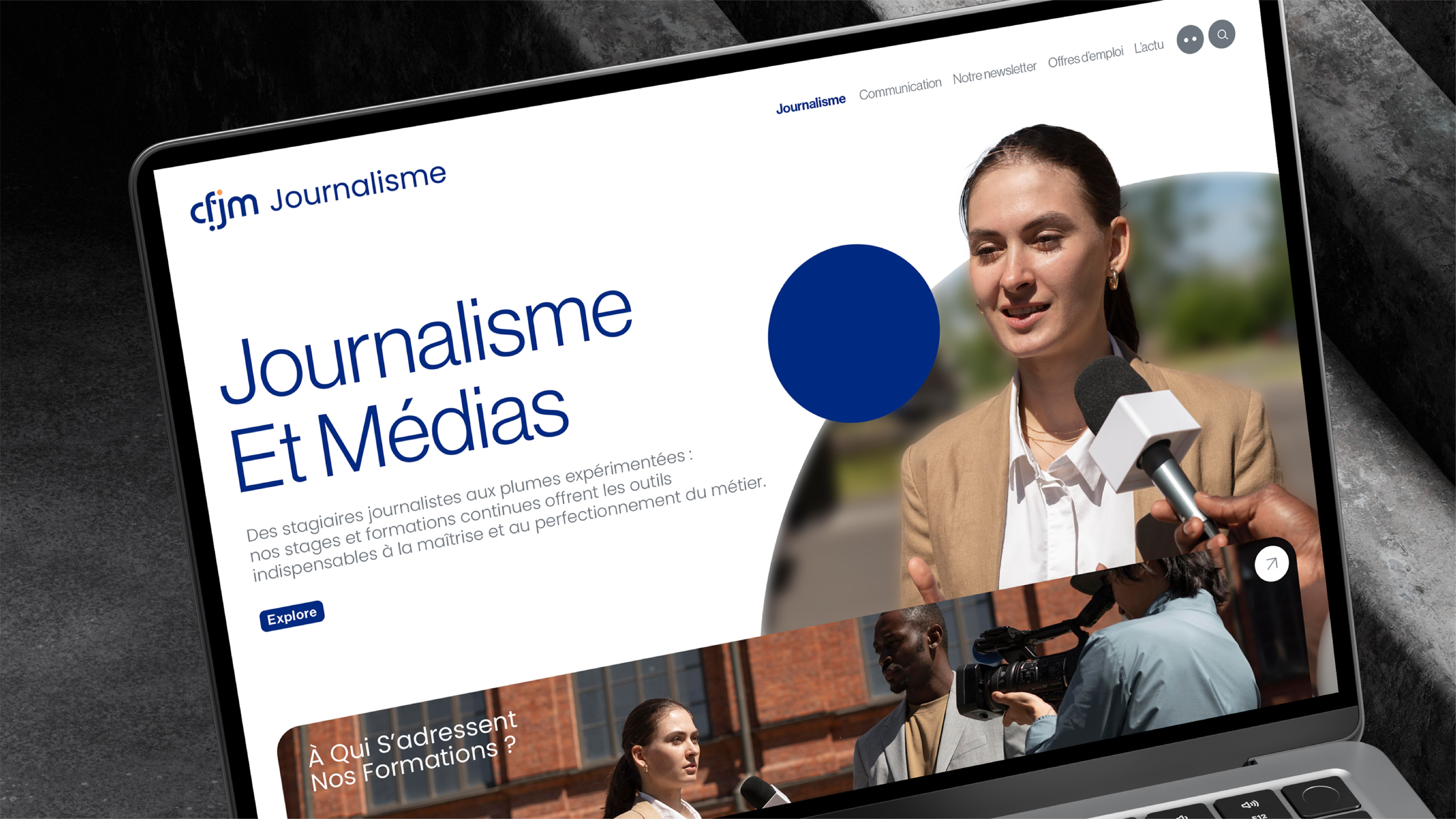
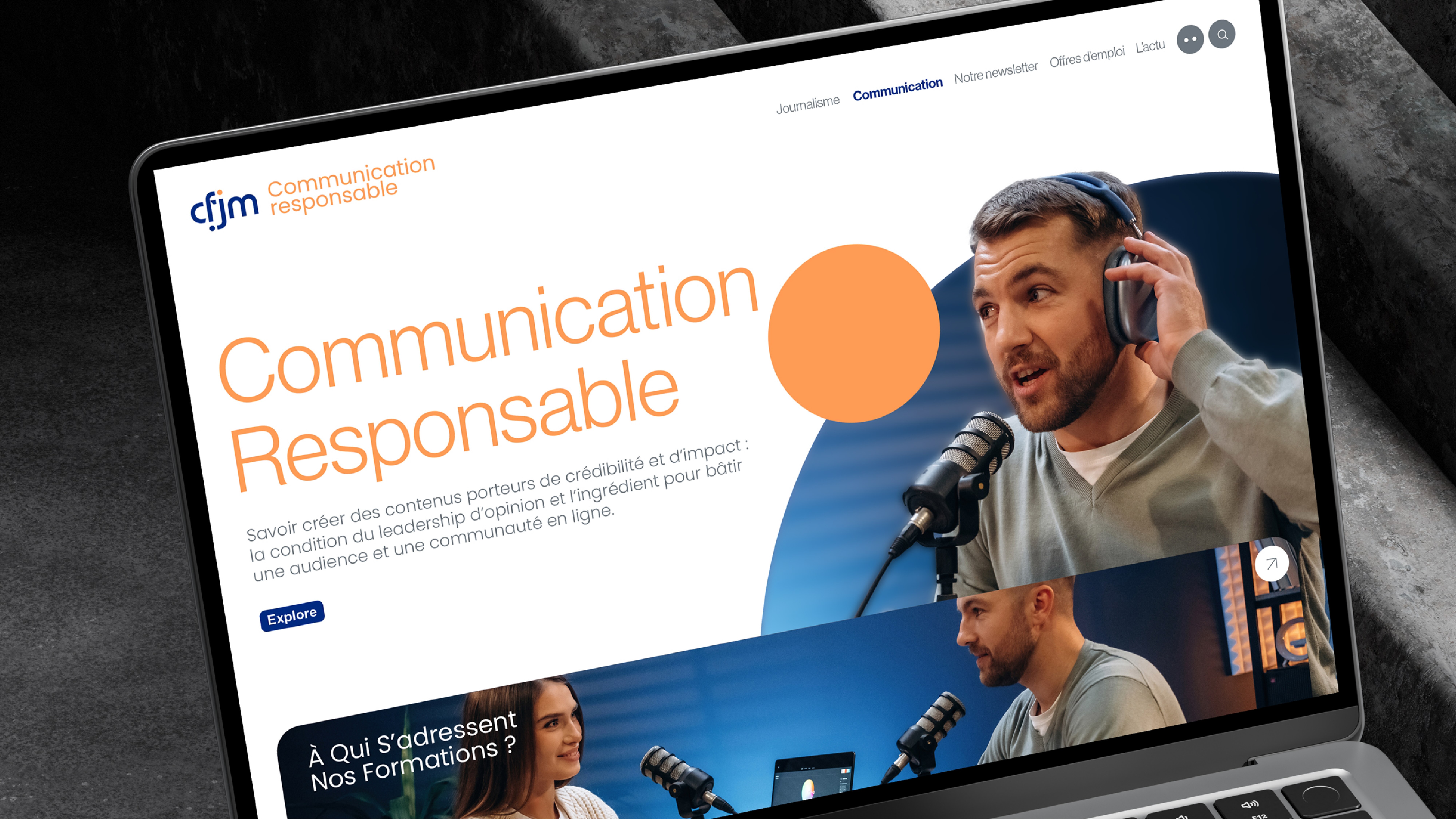
The logotype is built around a frame joined by two dots, journalism and communication. A deep blue for the rigour of one, a warm orange for the creativity of the other, an anthracite base shared by both. The logo never changes, only the colour of the domain does.

An identity delivered without rules degrades within six months. We deliver a documented system: logo construction, clear space, minimum sizes, prohibited uses, palette, typefaces, and templates for the documents the organisation actually produces. The test is not how good the guidelines look, it is whether someone who has never spoken to us can produce a correct document.
At CFJM, the system covers diplomas, certificates and attestations, signage, stationery, email signatures and social templates, each declined by stream.




.svg)
.svg)

"A wonderful collaboration with the DARE agency on the redesign of the CFJM’s visual identity! The teams were attentive to our needs, and the schedule was perfectly adhered to—a real plus. We are very pleased with the final result and the work accomplished. A positive experience!"

Directrice
CFJM
Your brand deserves better than ordinary.
30 minutes of honest conversation about your brand. No pitch, no sales, just a real discussion.

© 2025 lagencedare