


Context
In the non-profit world, legitimacy is earned first through emotion. The cause moves people, the donation follows. The difficulty is that emotion funds campaigns, rarely the services that have to hold for twenty years.
When the foundation came to DARE, on the eve of a shift to national scale, it had concrete utility and a discourse that kept pulling it back into the register of solidarity.

Case study
A cause does not need defending. It needs carrying by someone whose legitimacy nobody questions.
Every brand is judged on three levels, and we cross-reference them systematically: what it shows, what it actually is internally, and what its market values. The gap between those three readings is the diagnosis. We document it through an audit of existing materials, immersion sessions with leadership and then with the teams, and a benchmark that compares postures rather than aesthetics. The output is not a report but a reference framework: positioning, audiences, promise, tone.
At the foundation, mapping the sector revealed the real subject. Associations, public services and private players overlap around hearing loss, to the point where the people concerned do not know who to approach first.

A name is evaluated based on specific criteria, not personal preference. Each proposal is put through the same matrix: meaning, memorability, pronunciation in the national languages, availability, and the risk of confusion with other players in the sector. The board makes its decision based on a shared framework, not on gut feeling.
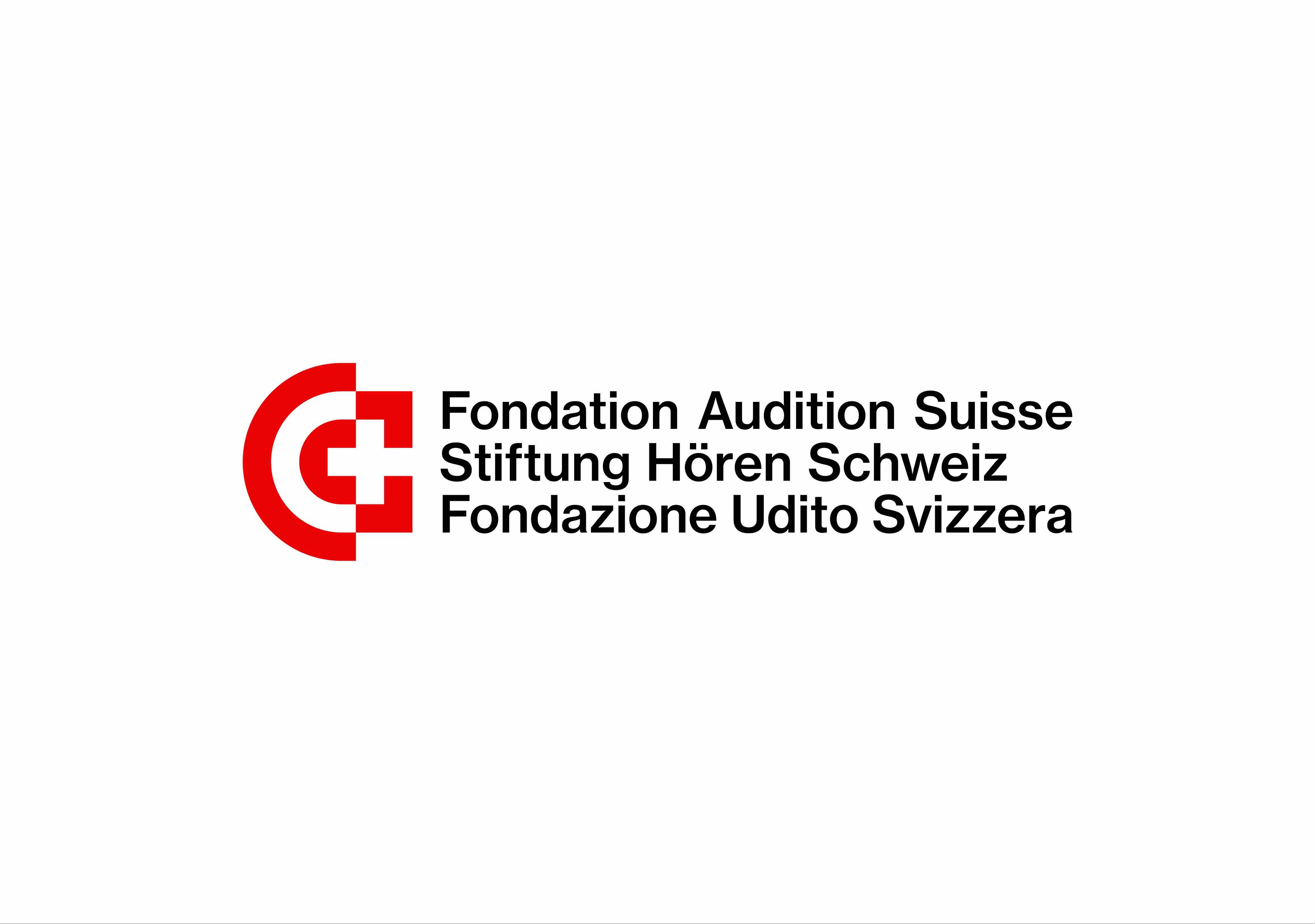
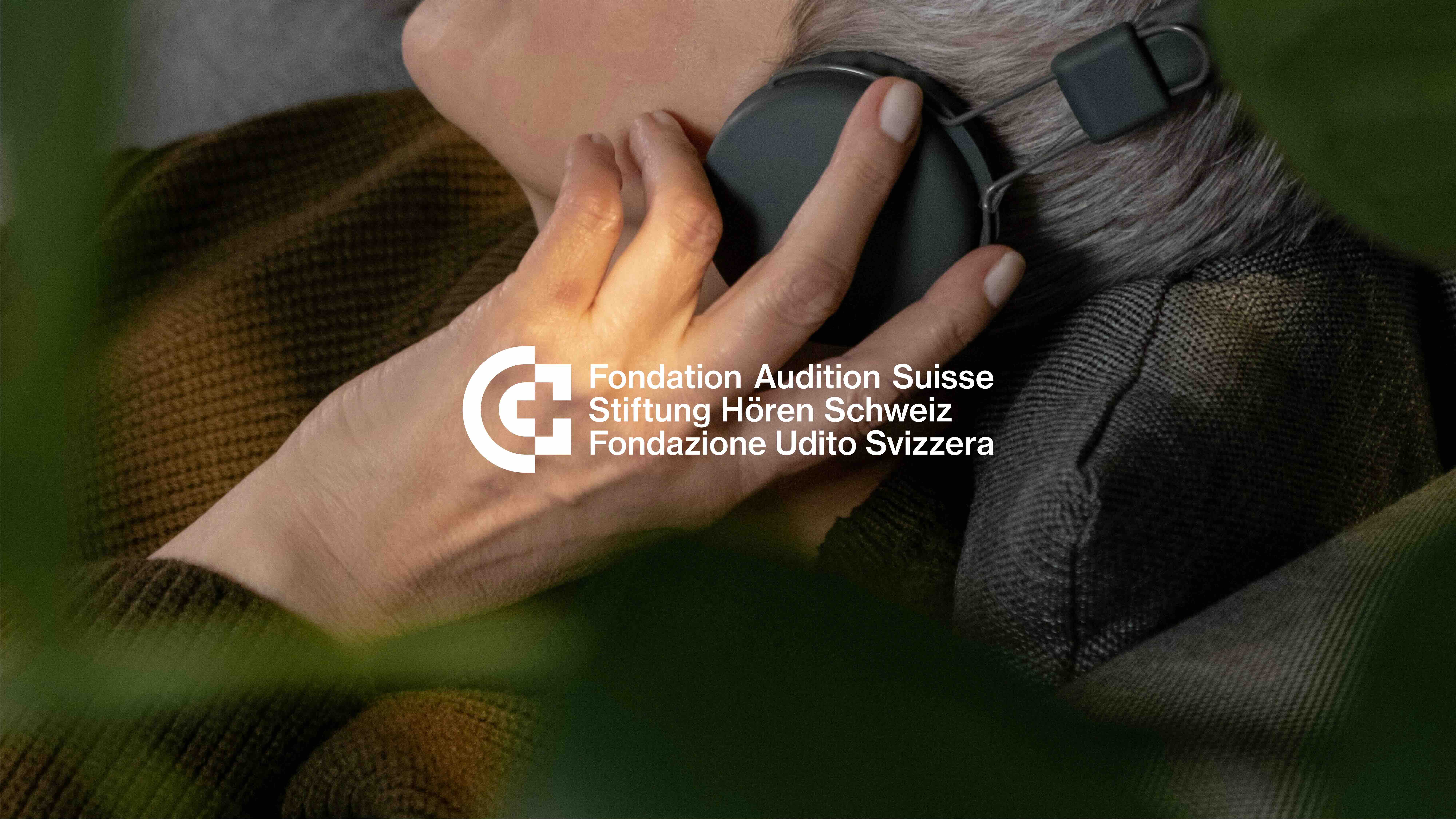
The foundation board opted for a descriptive name—Fondation Audition Suisse—which we subsequently adapted into three languages.

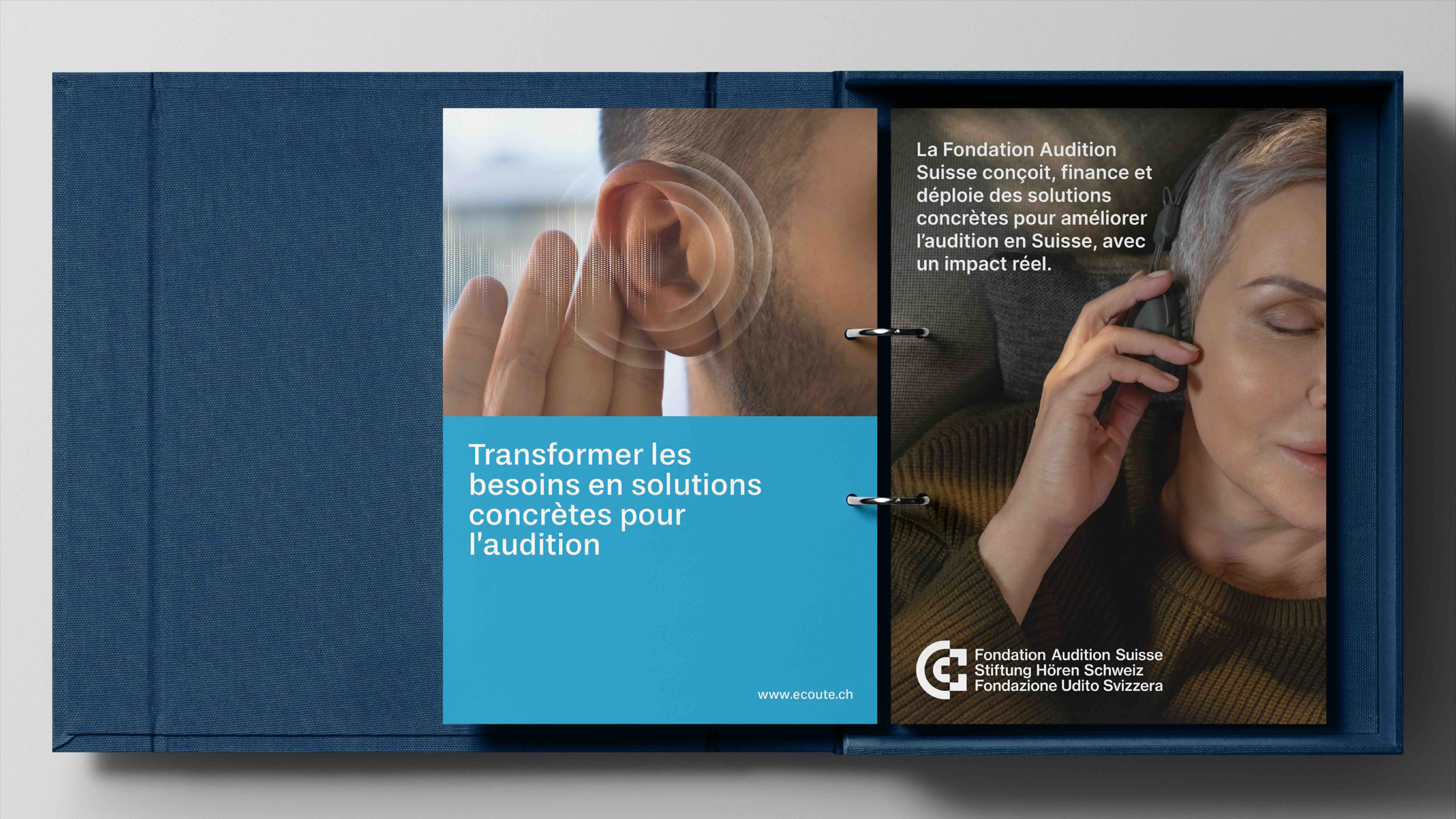
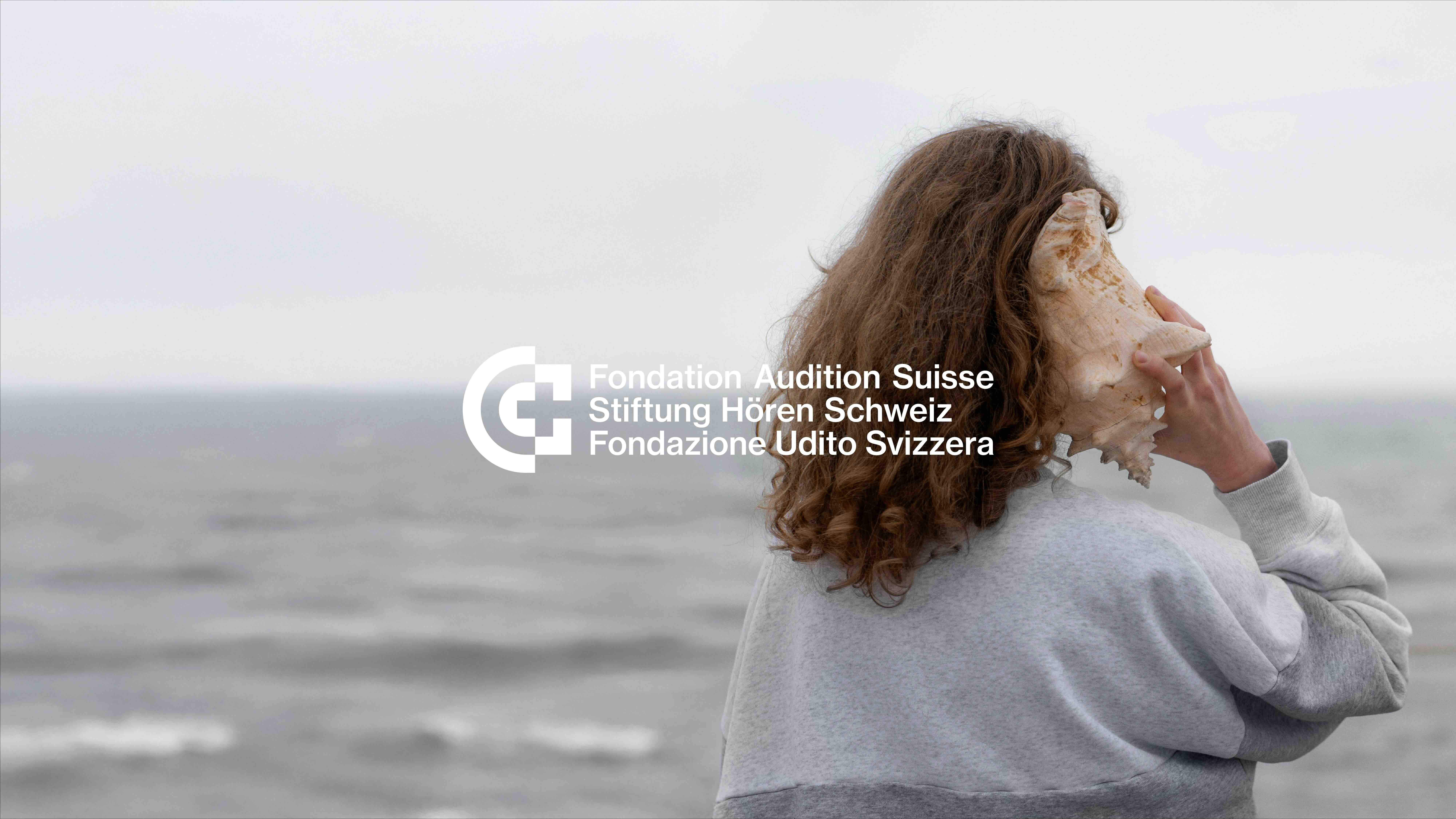
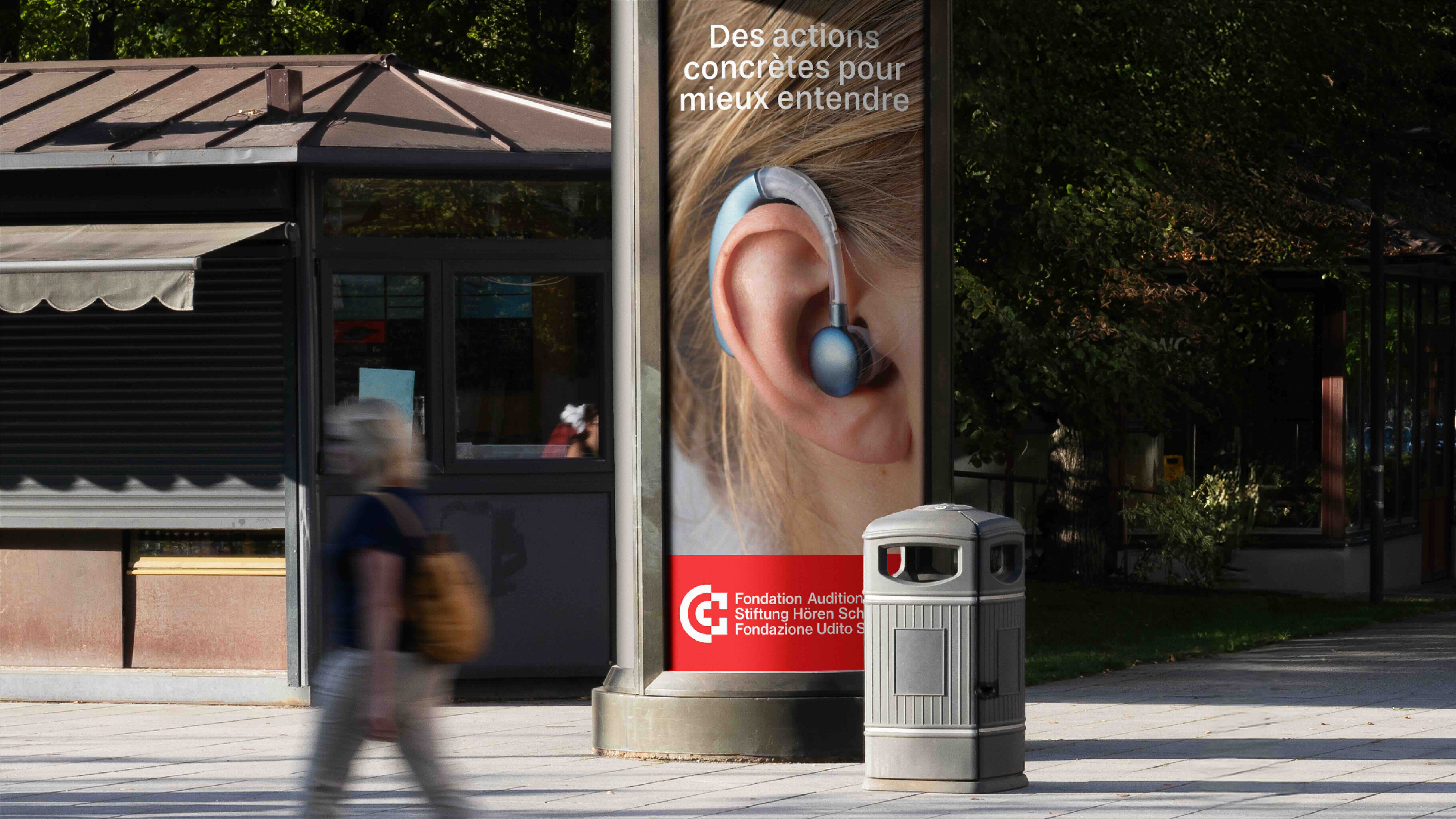
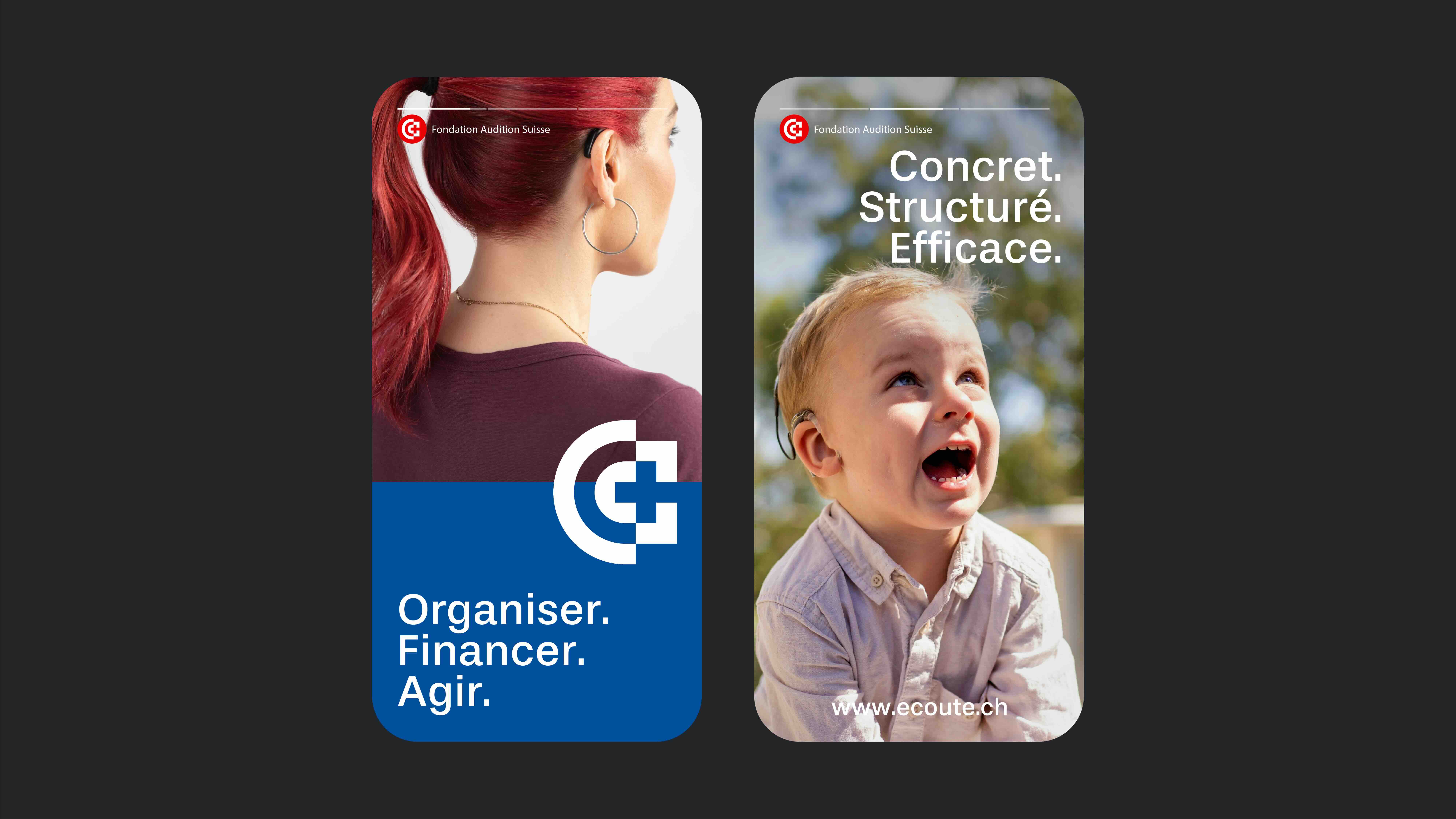
An identity is not a matter of personal taste; it stems from positioning, or else it fails to hold up. The logo and its construction, color palette, typography, layout principles, and physical and digital applications—everything originates from the same decision. The goal was to express the nature of a national institution without relying on the visual tropes of charity. The Swiss cross integrated into the symbol conveys a national scope, while the red and blue color scheme establishes a tone of high standards rather than mere compassion.
DARE remains the guardian of the brand throughout its rollout.
The foundation board opted for a descriptive name—Fondation Audition Suisse—which we subsequently adapted into three languages.



Your brand deserves better than ordinary.
30 minutes of honest conversation about your brand. No pitch, no sales, just a real discussion.

© 2025 lagencedare
